How Landing Pages Draw People to Your Site
Capturing your target audience’s interest comes from giving them the information they seek. New and returning visitors may visit your site for specific topics you cover, which they learn through a search or online ad. Then, once they click on your site, you have just a few seconds to capture their attention; ideally, this will lead to them becoming a loyal user later on. If you miss the first opportunity, you may not get a second chance. At least not easily. (See our remarketing blog post).
So, a user did a search or clicked on your online ad about a specific topic and arrived at your website. But, you didn’t just direct them to the homepage; you have it set up so that they go to a “landing page*” for that specific topic. Getting them to stay once they see your landing page is vital. How can you keep your target audience from leaving? Here are five tips and strategies to keep in mind when creating landing pages.
* From Wikipedia: In online marketing a landing page, sometimes known as a “lead capture page” or a “lander”, is a single web page that appears in response to clicking on a search engine optimized search result or an online advertisement. The landing page will usually display directed sales copy that is a logical extension of the advertisement, search result or link.
1. Include This, But Don’t Include That
With so many different elements to cover in a landing page, it’s easy to get carried away and make it too busy. When in doubt, ask this simple question: are visitors seeing content that’s useful to them? Make sure each landing page provides helpful information on the topic(s) that brought them to the site in the first place. If your landing page focuses more on selling yourself than helping your audience, you should trim it down.
One example of a good landing page:
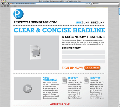
Image courtesy of Gavin Llewellyn.www.onetoomanymornings.co.uk. http://bit.ly/1h3oHVn
A good rule to remember is that at least 50% of the content on your landing page needs to focus on helping your visitors. And at most, 50% of the content should focus more on your company’s brand and promoting what you do. The better this balance is tilted towards helping your target audience, the more likely visitors are to stick around. Some portion of it needs to focus on selling your brand, but the challenge is to do it as little as possible while still getting the job done.
2. Put Info about your Company, Products, and Services in Easy Reach
Throwing all this important, yet lengthy, information at visitors all at once will overwhelm and scare them off. But putting the links to this info in close, easily identifiable reach is very important. If they’re interested and want to learn more, these are the first things they’ll look for. If a website doesn’t make them easily seen and clicked, visitors will immediately lose interest and be on their way. This tip is high on the list because a website can do everything right and miss this simple step, and lose out on potential leads.
Make sure that:
- The links to these pages are easily seen and stand out, but they’re not the main focus of your landing page.
- It should be easy for visitors to see that’s where they should go for more information, to get more involved, or whatever it is you hope them to do.
- If you have a company blog, be sure to include a link there too.
3. Make it Easy to Contact You
This one is very easy to forget, but is still important and closely tied to the first tip. Visitors will often need more information than what’s on the landing page, before contacting you, but if someone visits your site already intending to contact you, it’s an even bigger opportunity with less time to get their attention. So be sure you have a good contact button with easy reach at all times, whether it’s a form, an email address, or several social media links, especially on the landing page.
4. Reinforce Your Brand and Message
Making sure your website’s brand and core mission come across on the landing page is important since it gives new users the basic idea of what you do, and returning users a reassurance they’re in the right place. The trick is to put just enough information on the front to let users know the essentials, and only the really interested ones will go one to find more information.
Instead of giving the whole brand’s story right there, only include key aspects like the logo, tagline, and maybe an extra line or two of short and sweet explanation. Anything else risks the same information overload in visitors, however small, that will make them want to visit somewhere else. Save the big details for other pages.
5. Include Calls to Action, but Don’t Get Hasty
Calls to actions are a website’s way of sealing the deal for whatever your final goal for visitors is: signing up for a newsletter, subscribing to your blog feed, making a donation, or paying for whatever services you offer. However, despite this being very important, being too eager with your calls to action can also scare visitors away.
Calls to action can work either right on your landing page, or a page or two away from them. It’s important, however, to make sure visitors know what you have to offer them before you ask them for something. Asking too fast often makes visitors think a site is spammy and simply looking for cheap gains. Once a visitor knows the unique service or product you offer, that’s when you add in your call to action, so it’s more of a deal where both of you benefit. Visitors are much more eager to give something when they know exactly what they’ll be getting in return.
The major takeaway from all these points is that in your company’s landing pages, you must get a lot of different information across as fast as possible. You also need to make sure your visitors quickly see what they have to gain from reading more about your site, otherwise they’ll have little reason to stay and offer you their business or loyalty. Once a site can manage all that with some careful planning and design, it’s cleared the first – and biggest – hurdle into growing with its web presence.