Top 5 Mobile Design Trends in 2016 that Improve UX
The time has come: mobile device usage now trumps desktop usage in the United States. “Mobile digital media time in the US is now significantly higher at 51 percent compared to desktop (42 percent),” reports Smart Insights. The implications of this shift are obvious – if you want to entice, engage, and retain users, you will need to make user experience (UX) a central focus when designing your website or app.
Like all things cyber, mobile design is ever evolving. As new technologies and platforms emerge and as our understanding of UX grows, the science and art of user interface (UI) design continues to morph. This year, the top UI trends are all about user-friendly, intuitive use and simplicity in design. Check out these emerging practices that are doing wonders on improving UX.
Smarter Use of Overlays
Overlays (aka modals, popups, lightboxes), a longtime staple of desktop design, are making their way onto mobile platforms. Used correctly, these content boxes can provide users with quick, focused information without navigating to another screen. They can be helpful for things such as product descriptions, to display a video or image, for dropdown or sticky menus, or to present an important invitation. Overlays can get users to view content, complete a form, or make a decision.
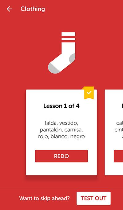
Duolingo, for example, cleverly implements overlays to display and navigate through lessons in a clean, intuitive manner.
A word of caution, though: modals must be used with reserve. They should add value to your issue, not present cumbersome speedbumps. Before implementing any overlays for mobile, ensure that they are useful and necessary, do not disrupt the users’ consumption, and provide clear, quick exit strategies, such as a large button on modal box within users’ natural thumb reach or a swipe-to-close function.
Semi-Flat Design
The starkness and simplicity of flat design captures users’ attention, and it is aesthetically pleasing to boot. But flat design too often lacks clickability signifiers, i.e., users don’t know what is clickable and what isn’t. This year, designers are solving the shortcomings of flat design with flat design 2.0 or semi-flat design. Hallmarked by subtle highlights, shadows, and gradients, semi-flat design can make your site or app more intuitive and improve UX.
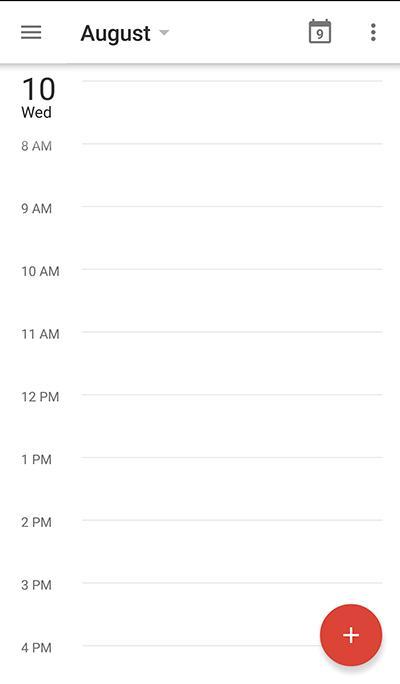
Flat design 2.0 maintains visual simplicity without sacrificing usability. Google Calendar does a good job of signaling clickability by using a subtle shadow on the top bar, as well as on the add button.
Natural Gestures
Ease of use in UI is essential. Natural gestures – particularly swiping and tapping – are trending right now in mobile design and with good reason. Users prefer these types of simple gestures that are easily executed and do not interrupt their flow. They don’t want to have to go through multiple or complex movements to execute or initiate a task. With gestures, intuitive navigation and simplicity are the name of the game in 2016 UI design trends. To ensure users stay within their comfort zone, consider using swipes and taps over more complex gestures like pinching and two-finger touches.
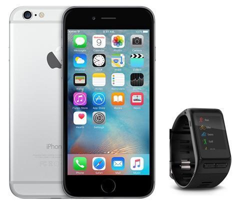
Screen Size Considerations
Mobile devices are getting larger and smaller. There is the dawn of phablets and other supersize devices on one hand, and the wearables/microdevices revolution on the other. This variance has thrown a monkey wrench into UX. The screen area that is in comfortable reach for the user differs for each screen size. What works for an iPhone 6 Plus will obviously not work for a Garmin GPS smartwatch.
To stay current and create comfortable interfaces, tailored UIs and responsiveness is paramount. It is becoming increasingly important for designers to carefully consider popular screen sizes when designing any type of app or platform.
Simple, Clean Fonts
Typography is an important but often overlooked facet of mobile design. Designers must balance aesthetic appeal and style with readability. Novelty, script, bold colors, and condensed ultra-urban style trends have come and gone. High contrast is out, too; designers are using subtler contrasts that are easier on the eyes.
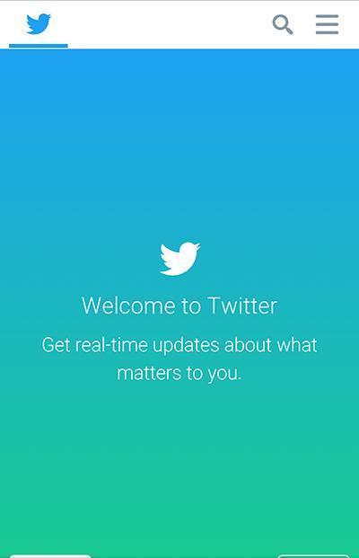
The trending techniques in 2016 include smooth edges, uniform font styles, and thin- to medium-width strokes. Current typographic styles also feature left-aligned, sans serif, and gray, white, or black text. It all boils down to readability. To improve UX, ensure your lettering is minimalist, legible, scalable. Case in point: Twitter.